Shutterstock
Guest post by Professor Siraj Ahmed Shaikh, Institute for Future Transport and Cities
 Human error was reportedly behind the false alarm, after an employee chose the incorrect option from a drop-down menu. A ballistic missile warning alarm that was wrongly triggered in Hawaii recently rams home the importance of the way interfaces are designed to prevent such major bloopers from happening in the first place.
It’s an unfortunate reality that we need to prepare for national emergencies due to war or natural disasters. Civil defence organisations, set up to coordinate and respond to such emergencies, are an important part of any modern state. Such entities – often a mix of state apparatus and voluntary organisations – play a critical role in terms of triggering alerts, coordinating response across law enforcement and emergency services, disseminating information and aiding response efforts to minimise impact and restore order.
Clearly, they are important systems for alerting nations to risks when disaster strikes. But such systems can go wrong.
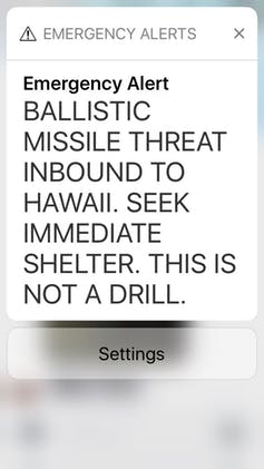
In Hawaii on January 13 an employee of the US state’s Emergency Management Agency set off a false alarm that seemed only too real to anyone seeing the stark warning of a “Ballistic Missile Threat Inbound to Hawaii”. It was sent to social media channels and mobile phones, followed by the chilling message: “Seek Immediate Shelter. This is not a drill.” The false alarm continued for 38 minutes and caused widespread panic.
The options of an actual alarm and a drill were provided in the same menu. One offered to trigger a “DRILL – PACOM (CDW) STATE ONLY”, while the other very similar sounding option was described as “PACOM (CDW) STATE ONLY”.
Triggering the alarm also brought up a confirmation dialogue box – the only prompt that could have prevented the errant message from being sent. The operator clicked on it to confirm that he did want to send out the alert and, in the panic that ensued, Hawaiians thought they only had minutes to live before a ballistic missile attack.
As a state government, we must learn from this unfortunate error and continue to prepare for any safety threat to Hawai‘i’s residents and visitors – whether it is a man-made threat or a natural disaster such as a hurricane or tsunami.
— Governor David Ige (@GovHawaii) January 14, 2018
Design for error
Poor interface design clearly fails to address human errors. Human-Computer Interaction (HCI) systems, examples of which are found ranging from aircraft cockpit design to interactive medical devices, have been studied extensively.
The underlying science tries to address optimal interaction between human and machine, in an effort to minimise gaffes such as the Hawaiian incident. A couple of design principles serve as pertinent reminders on this occasion.
Human error is to be expected – it’s not the case of if but when. Every step of the way mechanisms should be built in to prevent mistakes. Strong audiovisual cues could be used to make a notable distinction between genuine alerts and drills. Different menu styles could also be provided where alerting sequences could be different to drill sequences.
Simplicity of design should, however, trump all design elements to avoid complexity which in turn can also be problematic for the person behind the controls.
Two-person rule
Beyond the interface design, operational protocols could also be devised requiring two people to issue an alert. This prevents one person making a false choice, inadvertently or deliberately, and ensures that the probability of an error is significantly reduced. However, this may introduce an unnecessary delay or an added cost burden in case of genuine alerts where both operators need to be present at all times.
While years of research into HCI and safety-critical systems have served us well, be it aviation safety or healthcare and patient safety, the possibility of human error remains. The unfortunate mistake that led to the Air France AF447 accident in 2009, in which the pilot doggedly pulled on the control stick in a fatal climb even though the aircraft was repeatedly warning it had stalled, is a reminder that accidents do still happen despite advances in design. A cockpit scenario albeit has a radically different context to an early warning alert system.
Our interaction with technology is becoming more and more complex. Early warning systems are very welcome but the Hawaii mishap serves as an opportunity for a radical redesign, with a better understanding of their impact on the population: how do people respond to mass panic? How do we communicate alerts to reduce panic and promote orderly movement? It is also an opportunity for scientists to reexamine the social dynamics in an emergency situation.
At a time when the world is increasingly uncertain and our dependence on technology is so high, a redesign of poor warning systems is critical.
Originally written for ‘the Conversation’.


Comments are disabled